Data Visualization · Systems Design · IoT · Decision Support
Overview
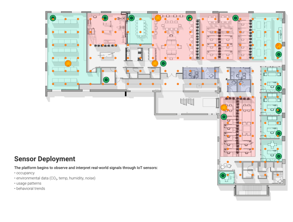
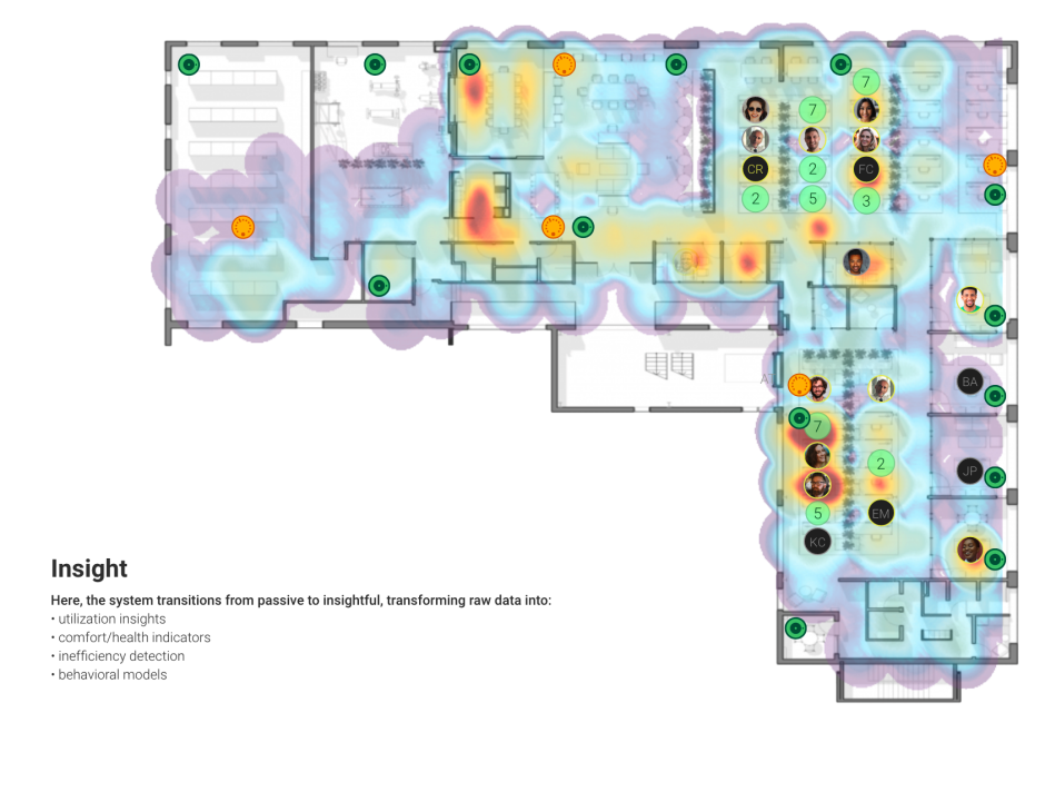
This project explored how real-time environmental and occupancy data can be synthesized into a clear, actionable virus risk indicator for indoor spaces. Built as part of the Elevated Space Data Visualization platform, the system integrates air quality metrics and occupancy patterns to help building operators, workplace leaders, and occupants better understand potential exposure risks.
Rather than presenting raw sensor data, the goal was to translate complex, multi-dimensional inputs into readable risk signals that support informed decision-making.
Project Details
-
Date: 09/01/2024 – 03/01/2025
-
Platform: Elevated Software — Space Data Visualization
-
Role: Project Lead · Product Designer · Data Visualization · Motion Graphics
Design Challenge
Indoor virus exposure risk is influenced by multiple interacting factors—air quality, occupancy density, duration, and environmental conditions. Individually, these data points are difficult to interpret; together, they can overwhelm users.
The challenge was:
-
How do we visualize complex, multi-variable risk without oversimplifying?
-
How do we support comparison across rooms and time?
-
How do we make risk understandable at a glance while preserving transparency?
Design Approach
The design focused on aggregation with legibility.
Key principles included:
-
Combining CO₂, particulate matter (PM), temperature, humidity, and occupancy into a single composite risk model
-
Using radar / polygon charts to show both overall risk and contributing factors
-
Maintaining consistent visual language across rooms to enable quick comparison
-
Using color, scale, and hierarchy to balance urgency with clarity
The visualization avoids binary “safe/unsafe” judgments, instead presenting risk as a spectrum that can be monitored and managed.
System Architecture & Data Flow
-
Real-time IoT sensor data ingestion (air quality + occupancy)
-
Normalization and weighting of environmental variables
-
Continuous recalculation of risk indicators
-
Visualization updates across multiple spaces simultaneously
This allowed building teams to compare rooms, identify emerging risk patterns, and intervene proactively.
Interaction & Motion Design
Motion graphics were used selectively to:
-
Communicate changes over time
-
Highlight deviations from baseline conditions
-
Reinforce cause-and-effect relationships between variables
Impact & Outcomes
-
Enabled rapid assessment of indoor environmental risk
-
Supported data-informed decisions around space usage and ventilation
-
Created a shared visual language for technical and non-technical stakeholders
-
Demonstrated how IoT data can be translated into meaningful operational insight