Product Design · Data Visualization · Motion Systems · Spatial Analytics
Overview
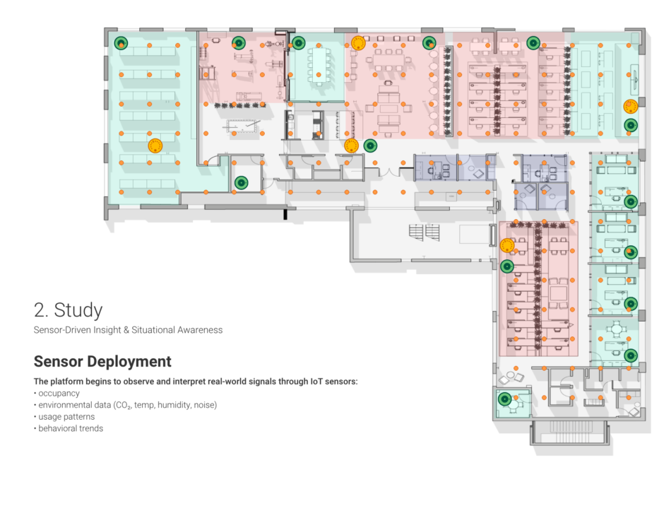
This project focused on visualizing real-time and historical occupancy data collected from over 200 motion and presence sensors across a commercial interior environment. The goal was to transform raw sensor data into spatially meaningful insights that could support decision-making around space utilization, operational efficiency, and future workplace design.
Developed as part of the Elevated platform in partnership with Siemens Enlighted, the system combined data aggregation, visual mapping, and motion-based storytelling to make invisible behavioral patterns visible.
Project Details
-
Date: 09/01/2021 – 03/01/2022
-
Platform: Elevated Software
-
Role: Project Lead · Product Designer · Data Visualization · Motion Graphics
-
Scope: 200+ occupancy motion sensors
- Partnership with Siemens Enlighted


Design Challenge
How can large-scale occupancy data be translated into a visualization that is:
-
spatially intuitive,
-
temporally meaningful, and
-
immediately actionable for non-technical stakeholders?
The challenge was not collecting data — it was making sense of movement over time in a way that aligned with how people understand space.
Design Approach
The design approach centered on spatial context first, data second.
Key principles included:
-
Anchoring data directly to architectural floor plans
-
Using heatmaps to communicate intensity, duration, and patterns of occupancy
-
Allowing time-based playback to reveal behavioral rhythms
-
Reducing cognitive load through minimal UI and restrained color systems
Motion and animation were used intentionally—not decoratively—to communicate flow, density, and change over time.
Data Visualization System
The visualization system included:
-
Real-time and historical occupancy mapping
-
Sensor-to-space aggregation logic
-
Timeline-based playback to compare patterns across days and time ranges
-
Heatmap overlays calibrated for clarity at multiple zoom levels
By combining spatial drawings with live data, the system functioned as a digital twin–lite, offering insight without overwhelming users with dashboards or charts.
Prototyping & Iteration
Early concepts explored abstract network visualizations of sensor relationships, which were later refined into floor plan–based heatmaps after user feedback emphasized spatial legibility.
Iterative testing focused on:
-
Color calibration for dense sensor clusters
-
Readability at different scales
-
Interpreting overlapping activity zones
-
Communicating “absence” as clearly as “presence”
Impact & Outcomes
-
Enabled stakeholders to identify underutilized and high-traffic zones
-
Supported data-driven conversations around space planning and workplace strategy
-
Demonstrated the value of occupancy analytics beyond simple counts
-
Established a visual language reused across other Elevated platform features
Reflection
This project reinforced the idea that data becomes meaningful only when it is grounded in human context. By embedding analytics directly into spatial representations, the visualization bridged the gap between sensor networks and lived experience—turning abstract numbers into narratives about how people actually use space.